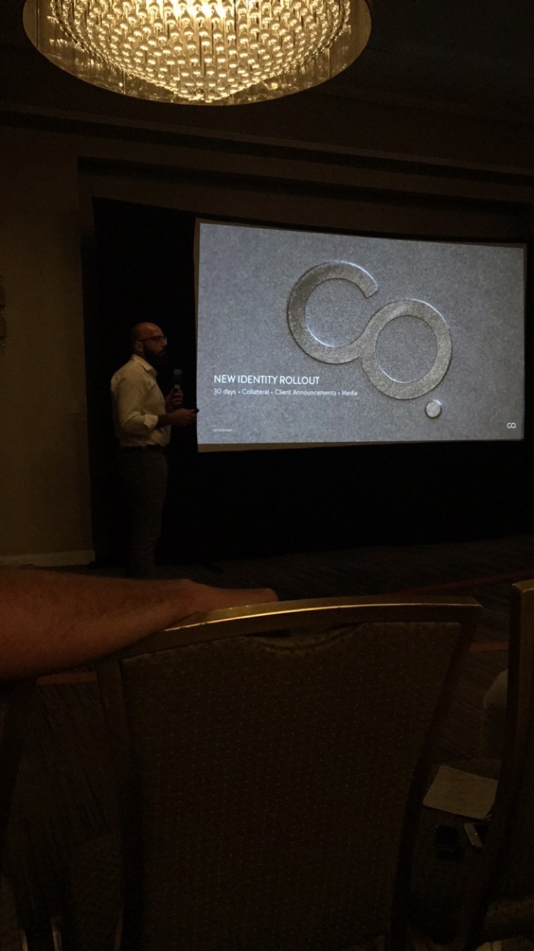
'THE COMPANY OF OTHERS' REBRANDS INTO 'THE COMPANY'
THE COMPANY: CREATING THE NEW BRAND STORY
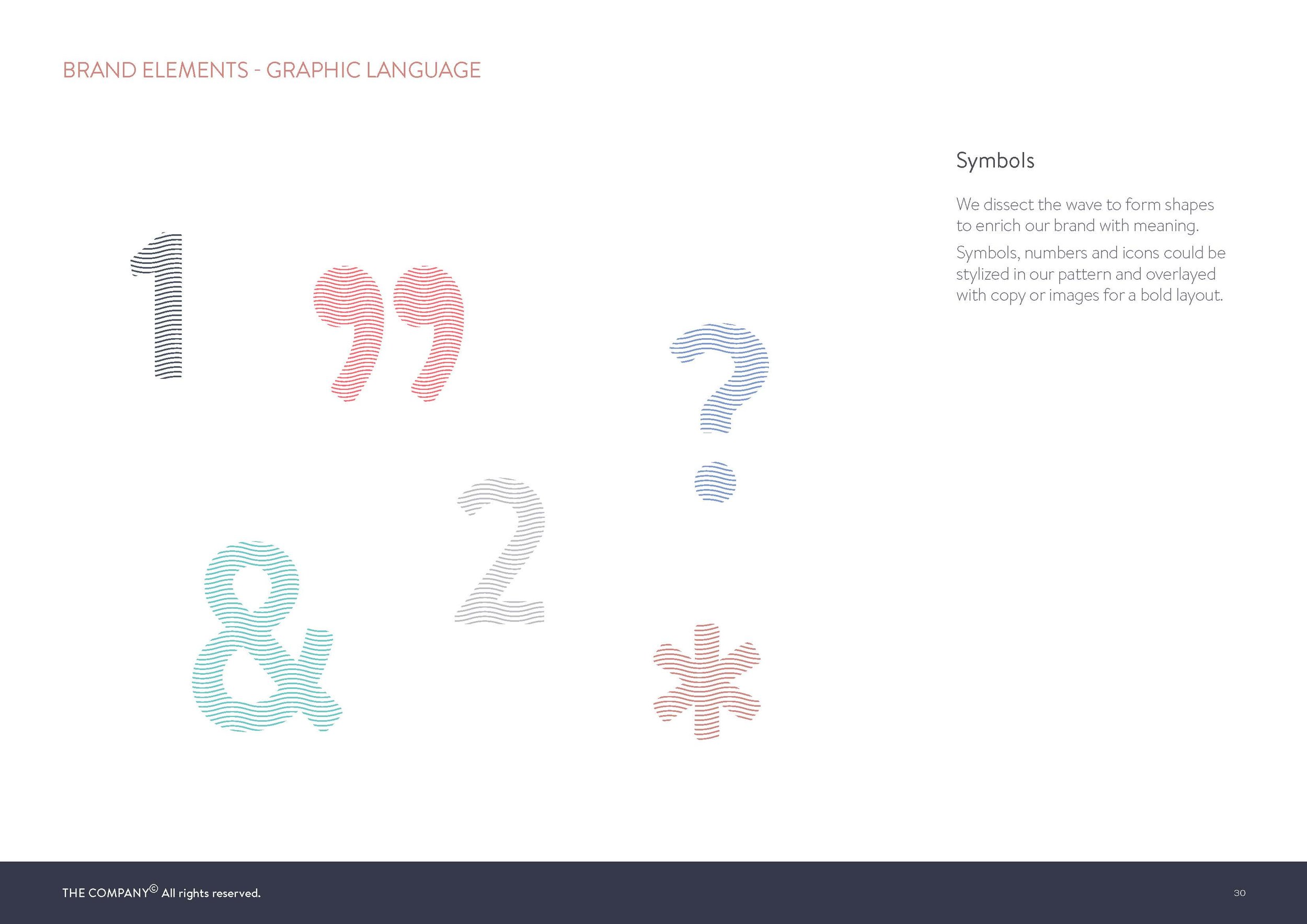
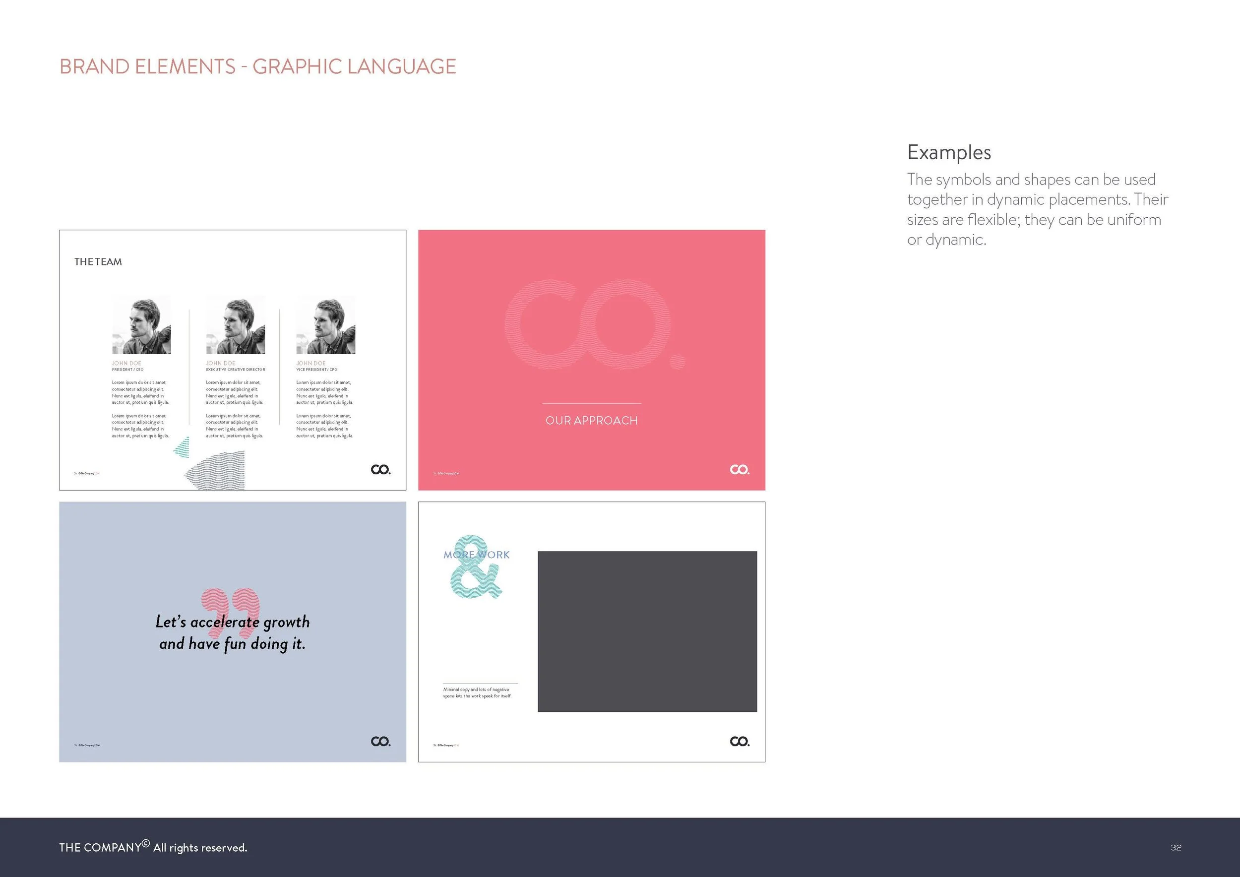
The Company’s identity and story inspired our use of geometric shapes, primarily starting with the circle. One of our core strengths in the industry is being a self sufficient agency, one that prides itself on having the right tools to provide a 360 approach for our partners. These tools are graphically represented in basic geometric forms and are directly derived from the ‘circle grid’ we create for our identity. We work with these tools in different shapes, colours, sizes, and compositions to guarantee finding the perfect tailored and crafted solution.

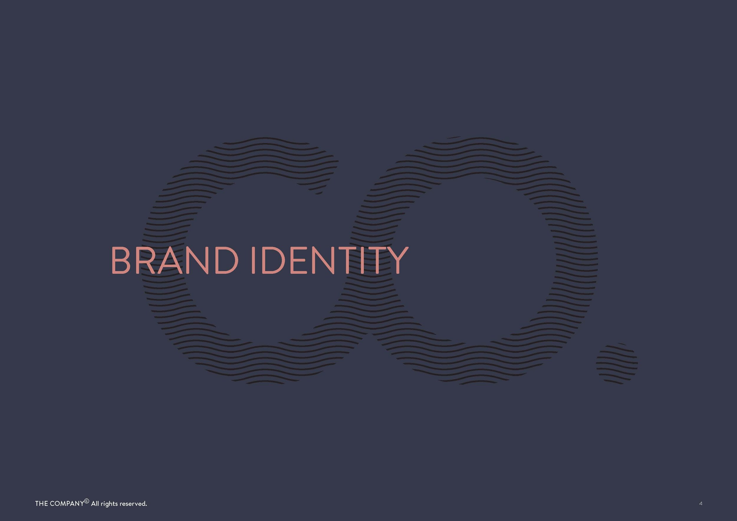
THE COMPANY IDENTITY
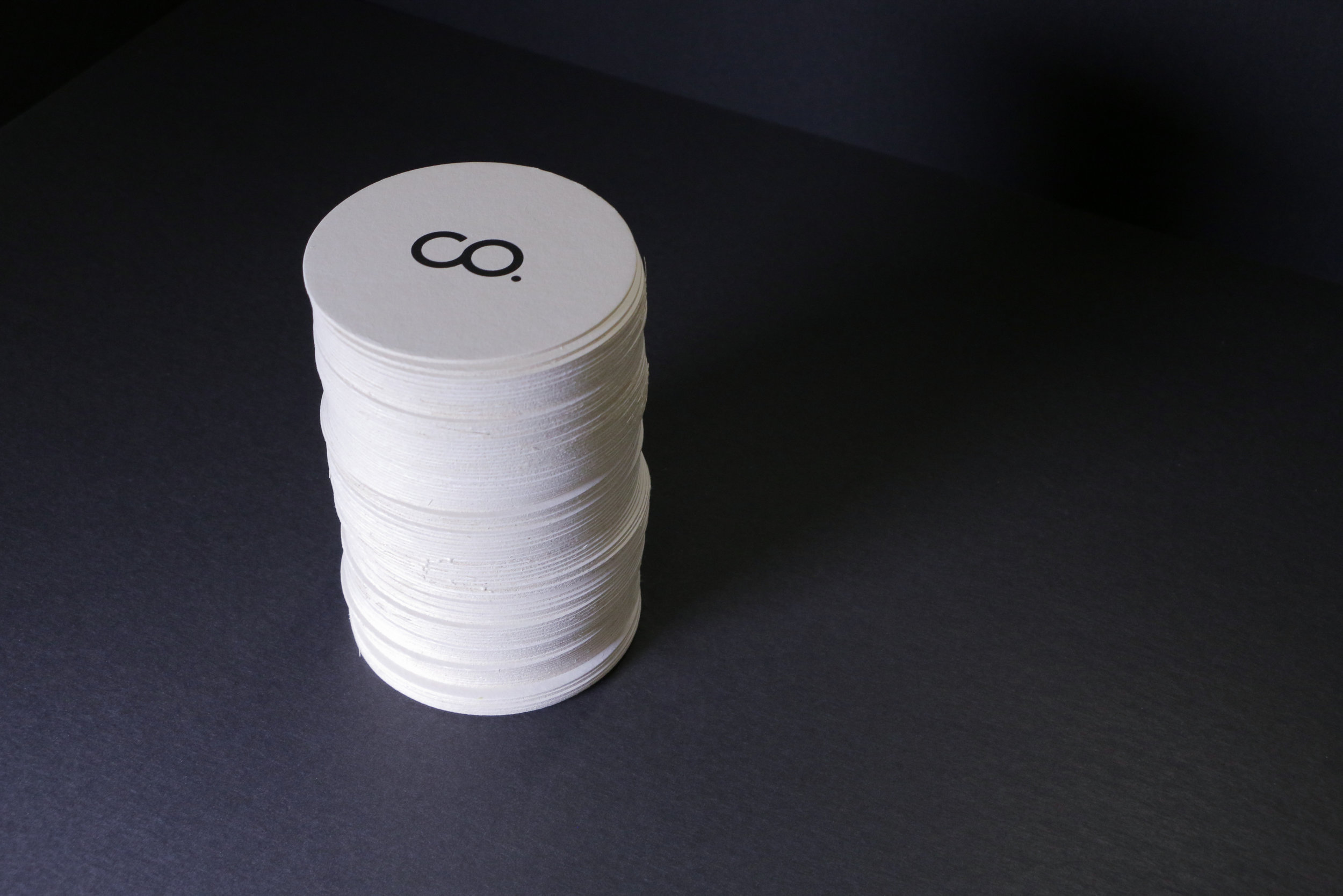
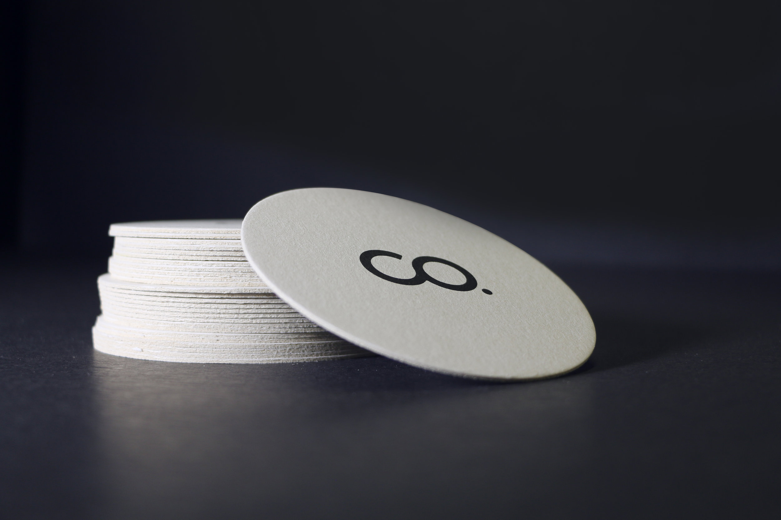
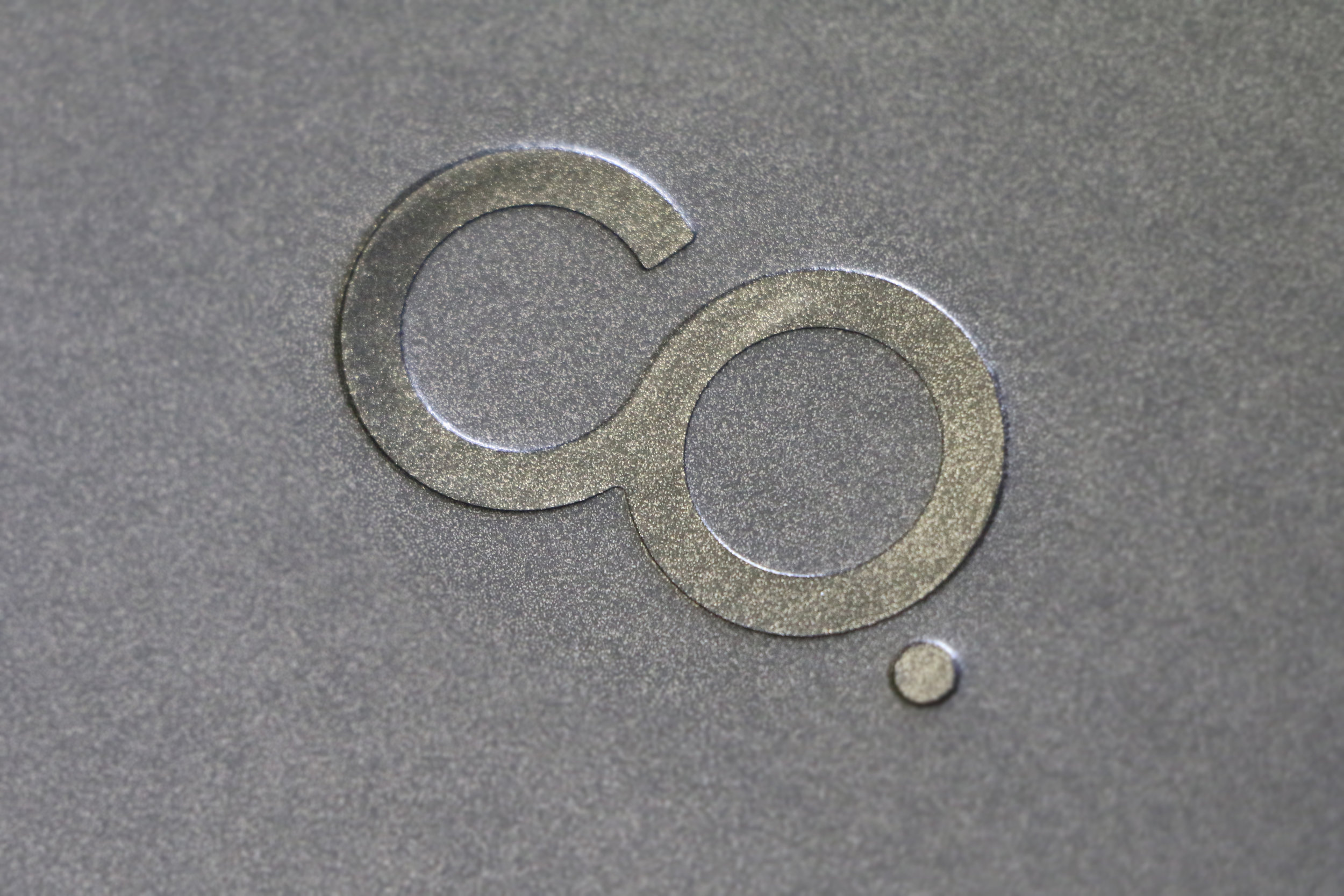
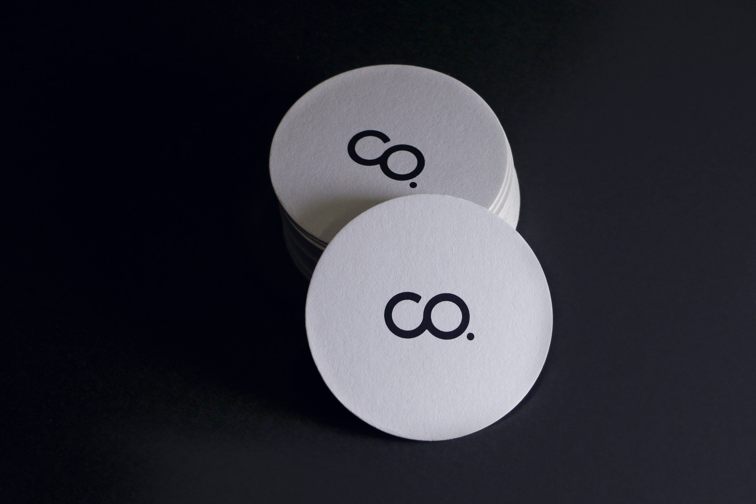
The brand identity consists of two elements: the icon, which is designed as an abbreviation for The Company (using the C and O letters). Those letters are crafted to work as a single shape, and designed to integrate with the brand marque typography.
The second element is our type marque, crafted to compliment the icon with modern and geometric-shaped letters, and is considered the primary logo for the brand.
Showing: New Primary Logo and Icon

Showing: 'CO.' logo construction animation

BRAND ELEMENTS
PRIMARY COLOR PALETTE

PRIMARY ACCENT

SECONDARY ACCENTS

TYPOGRAPHY

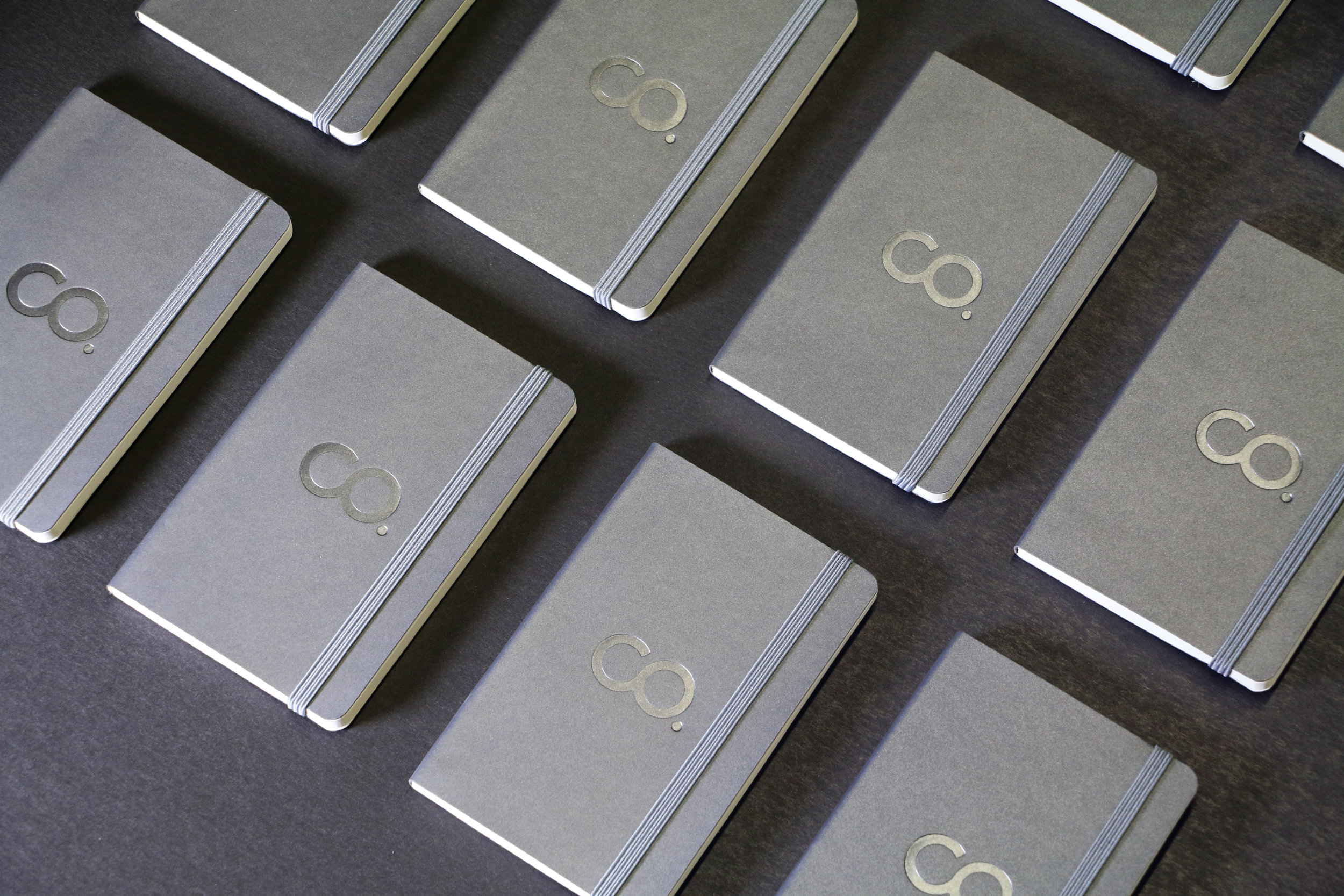
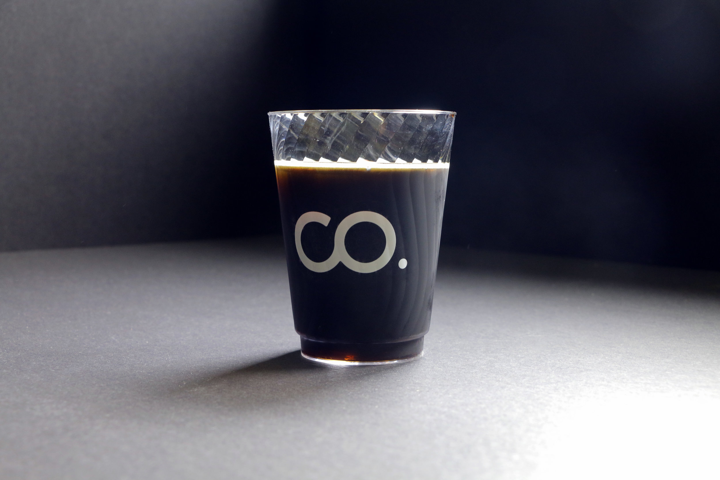
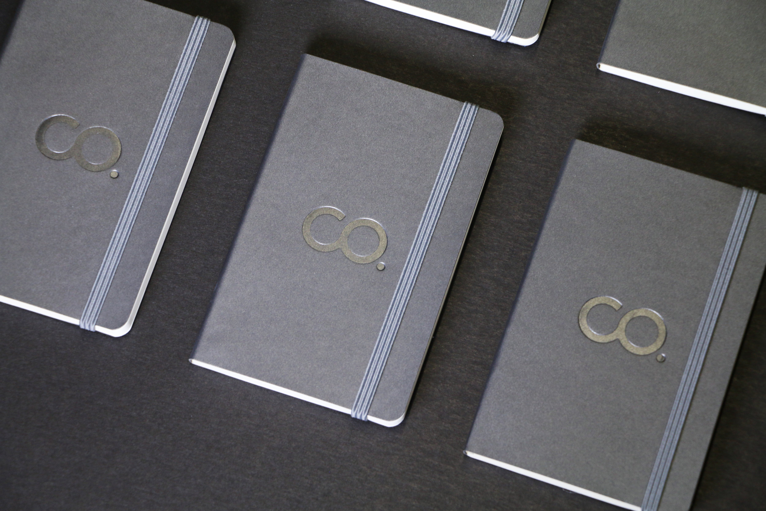
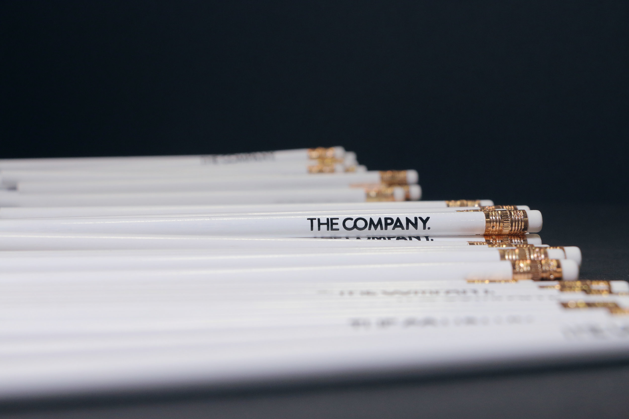
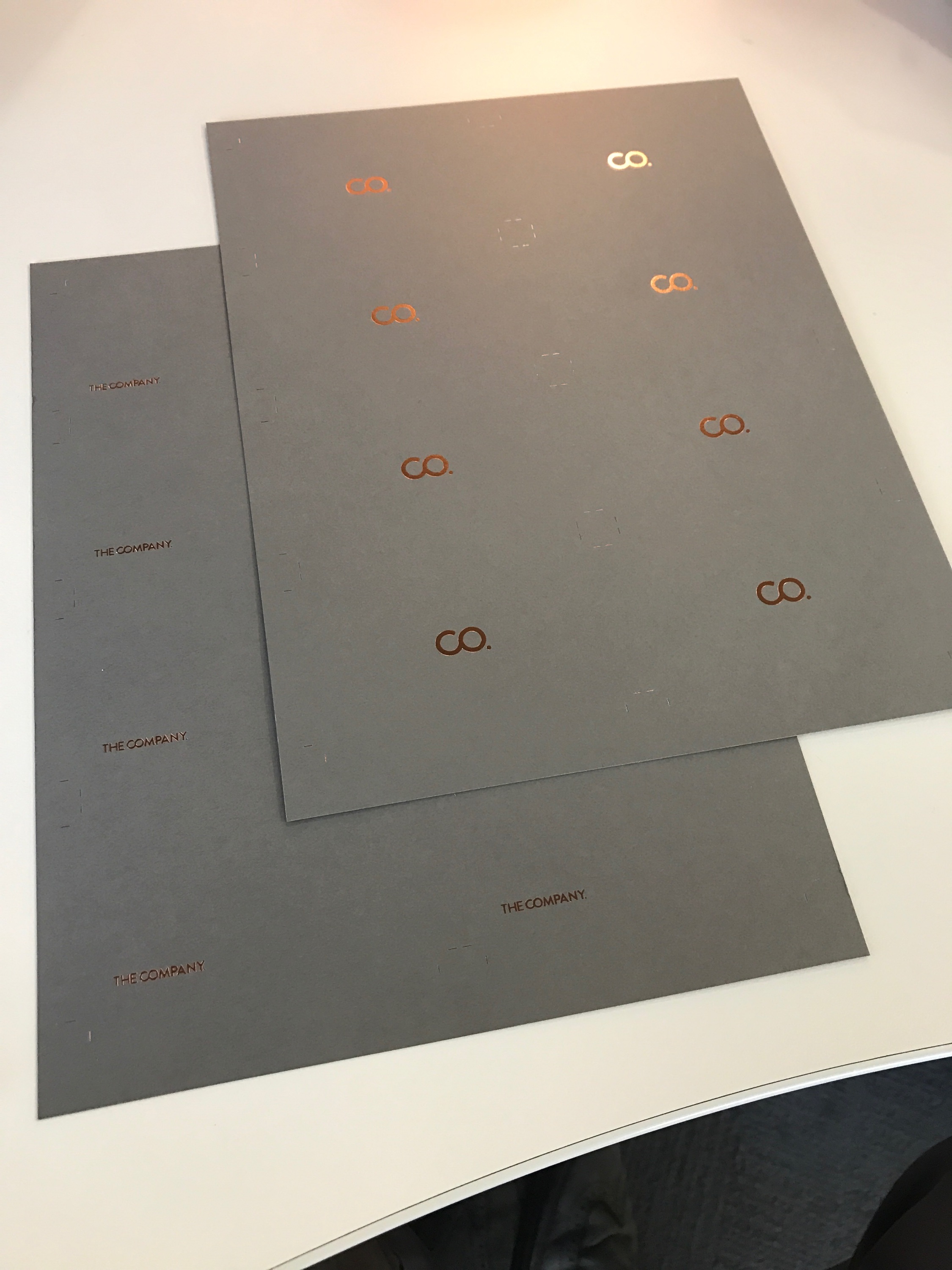
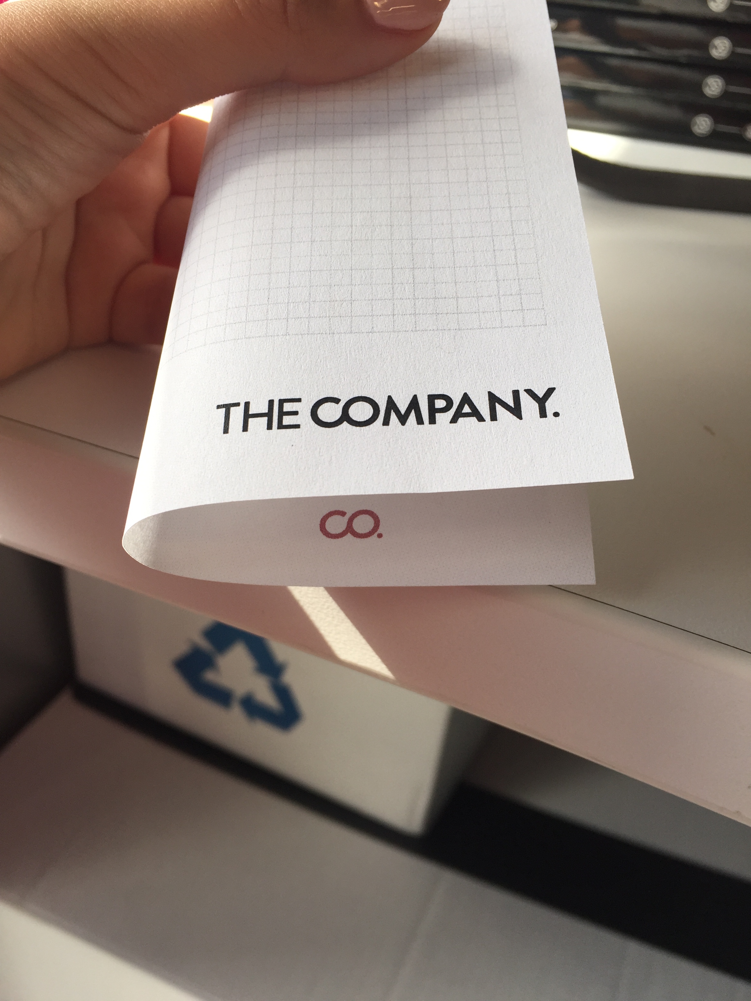
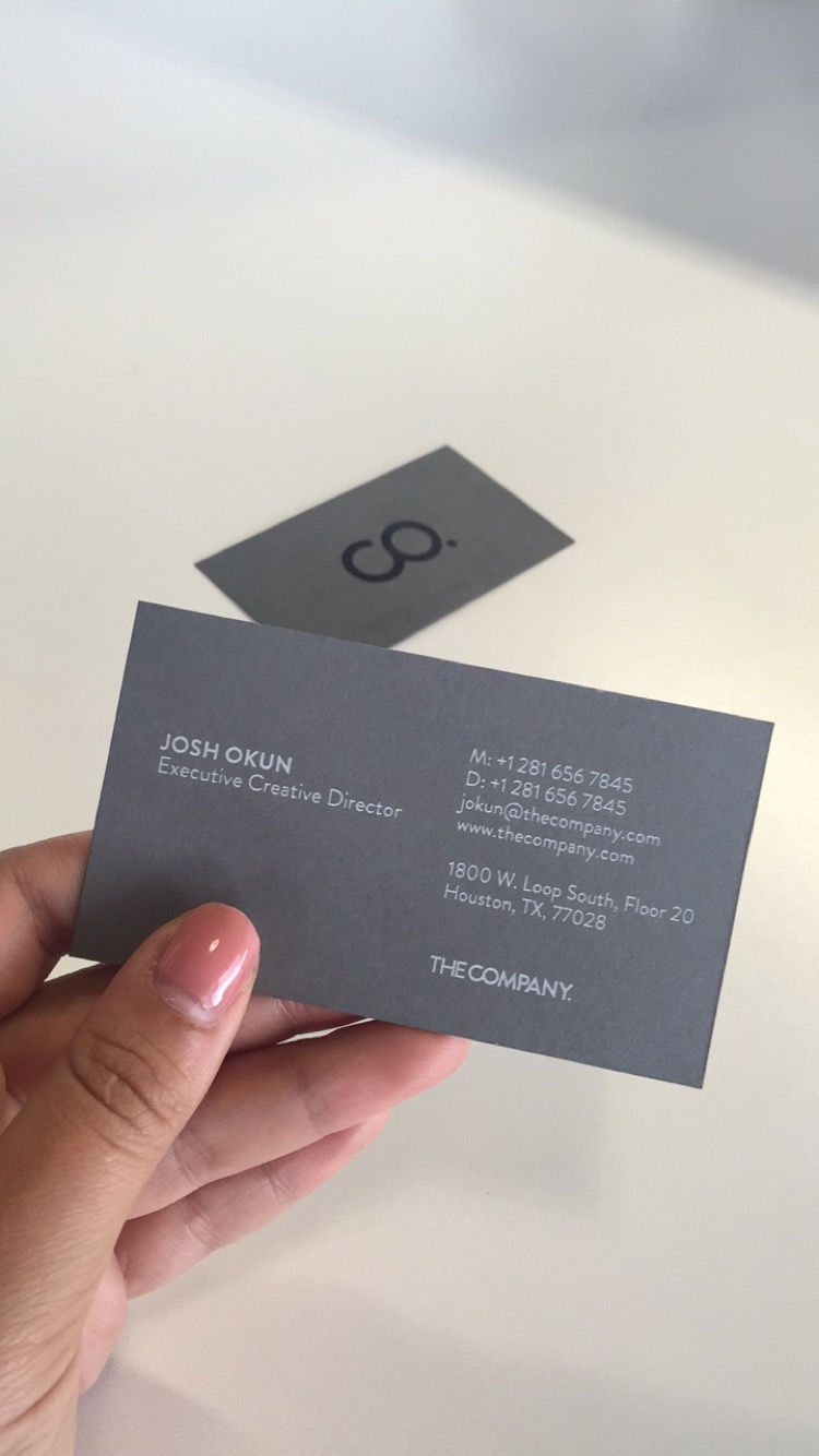
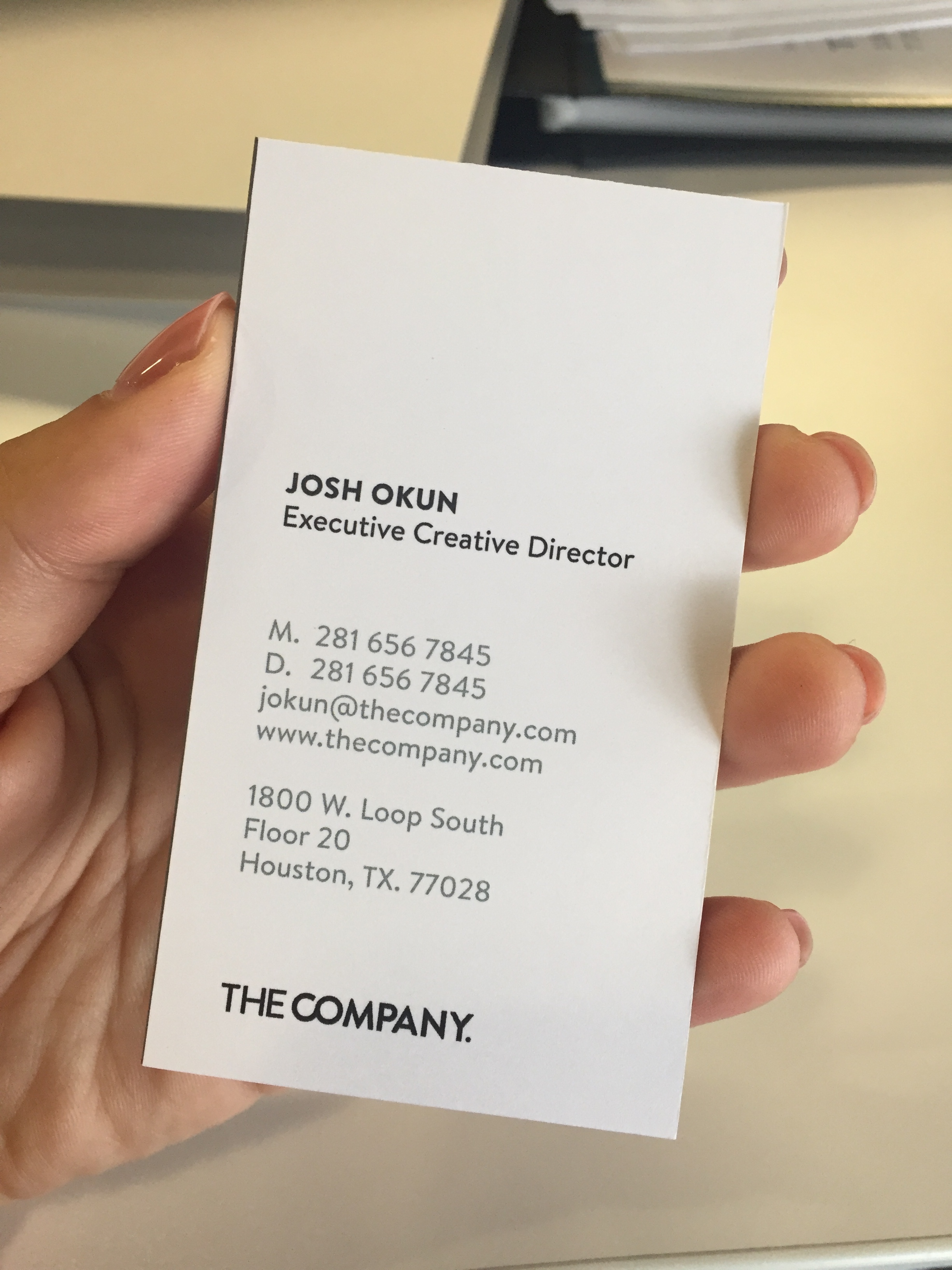
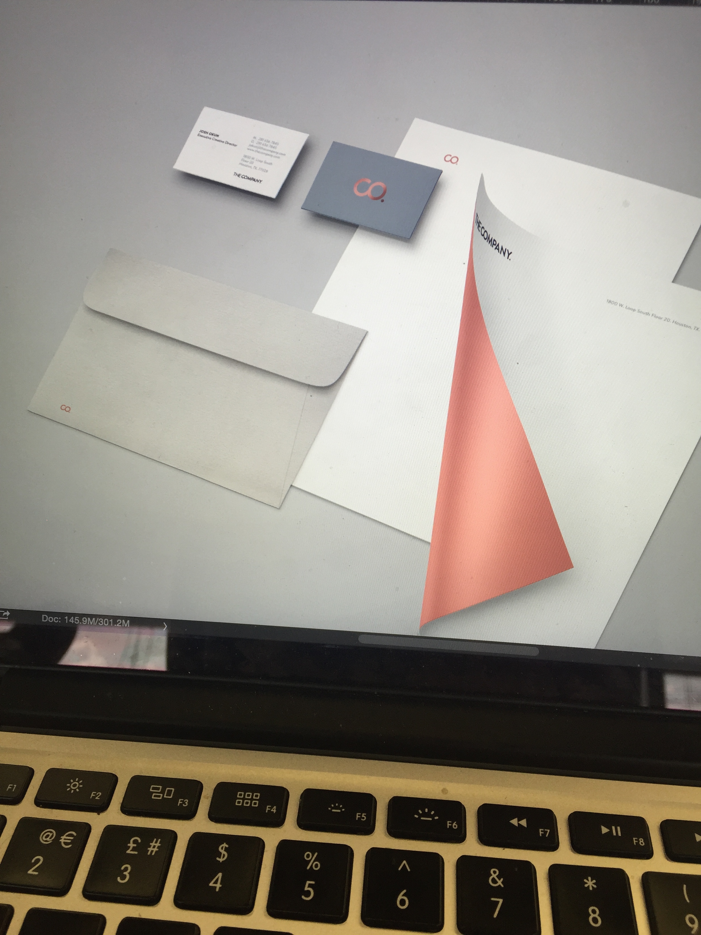
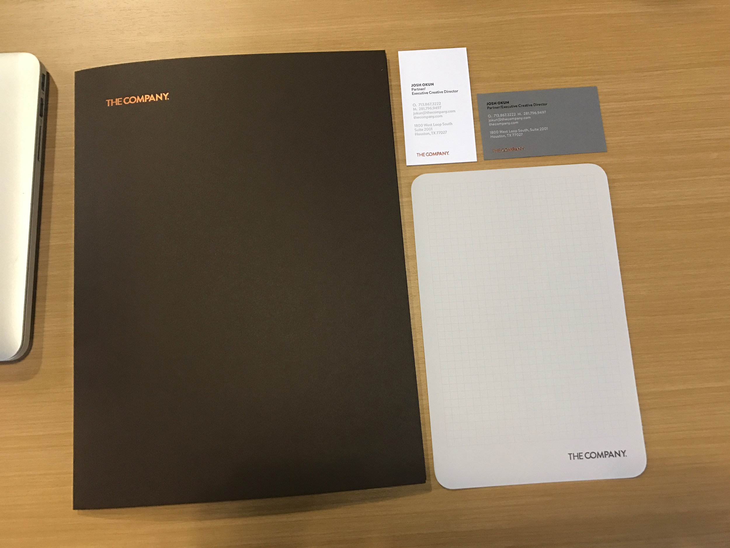
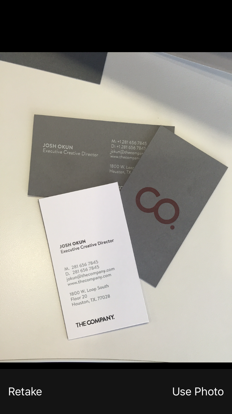
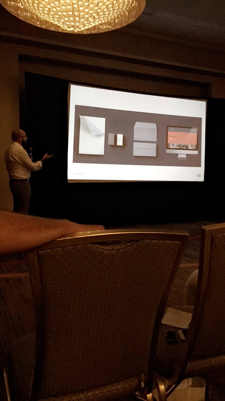
Stationery
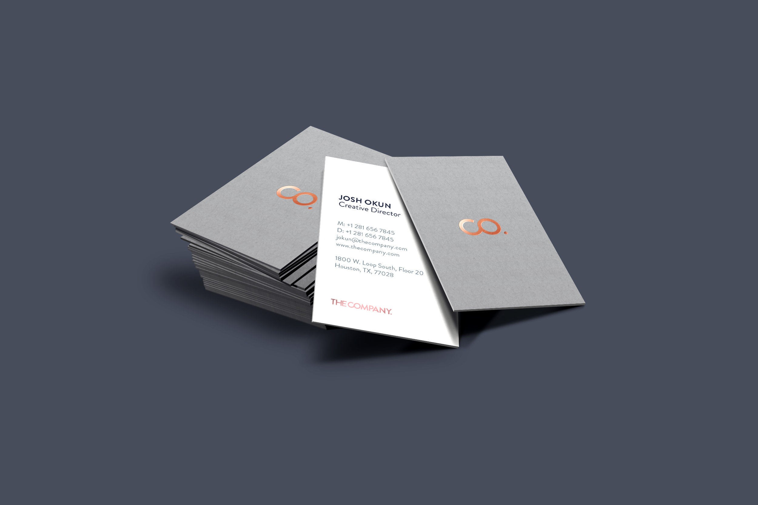

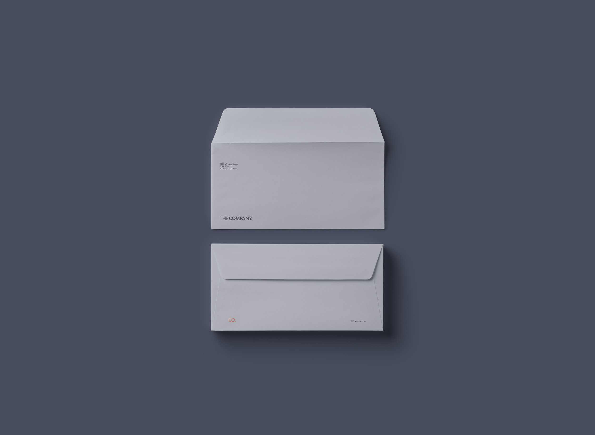
By using a range of blue-gray shades, we can create a rich set of stationery.
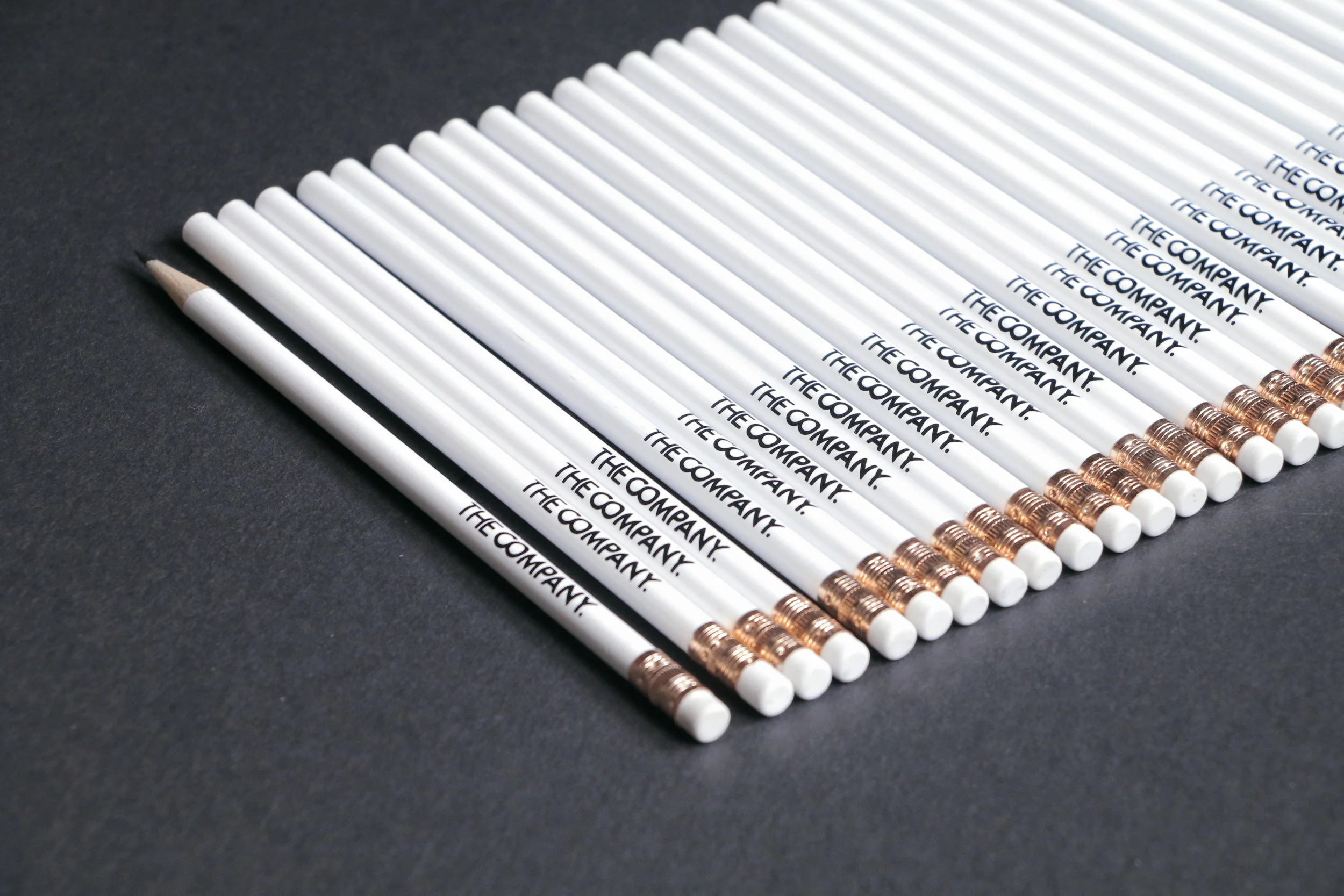
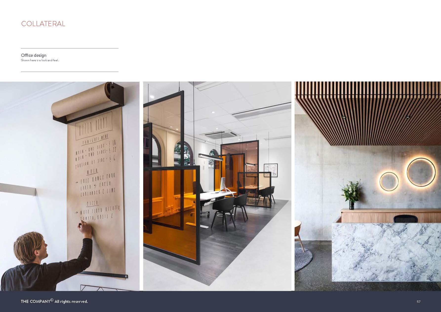
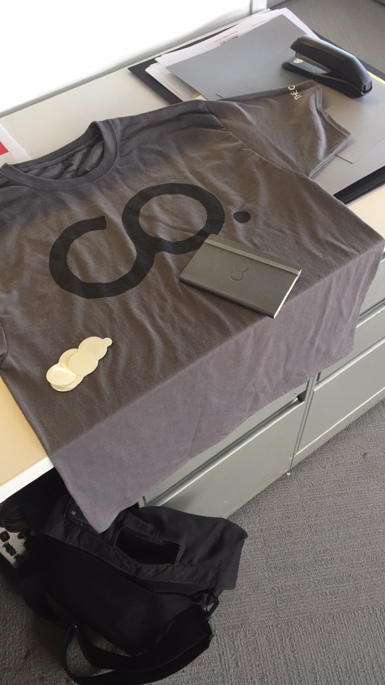
Collateral


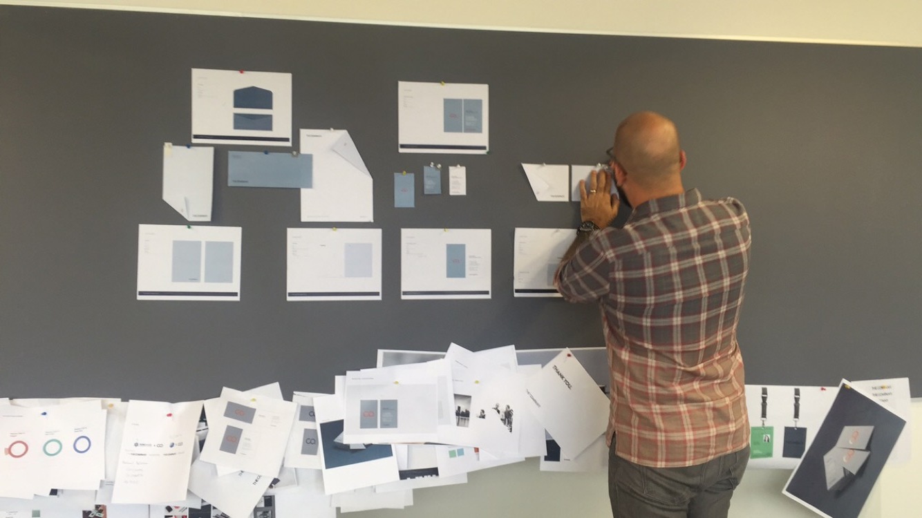
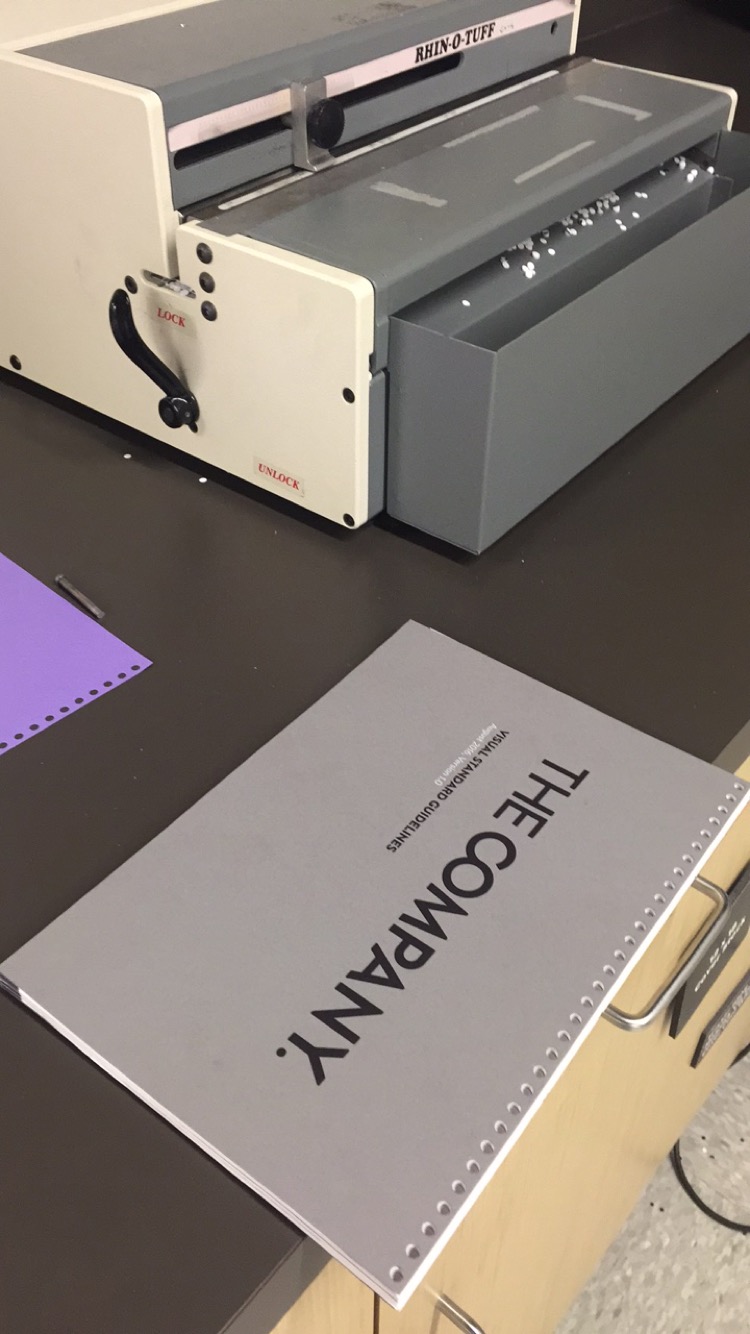
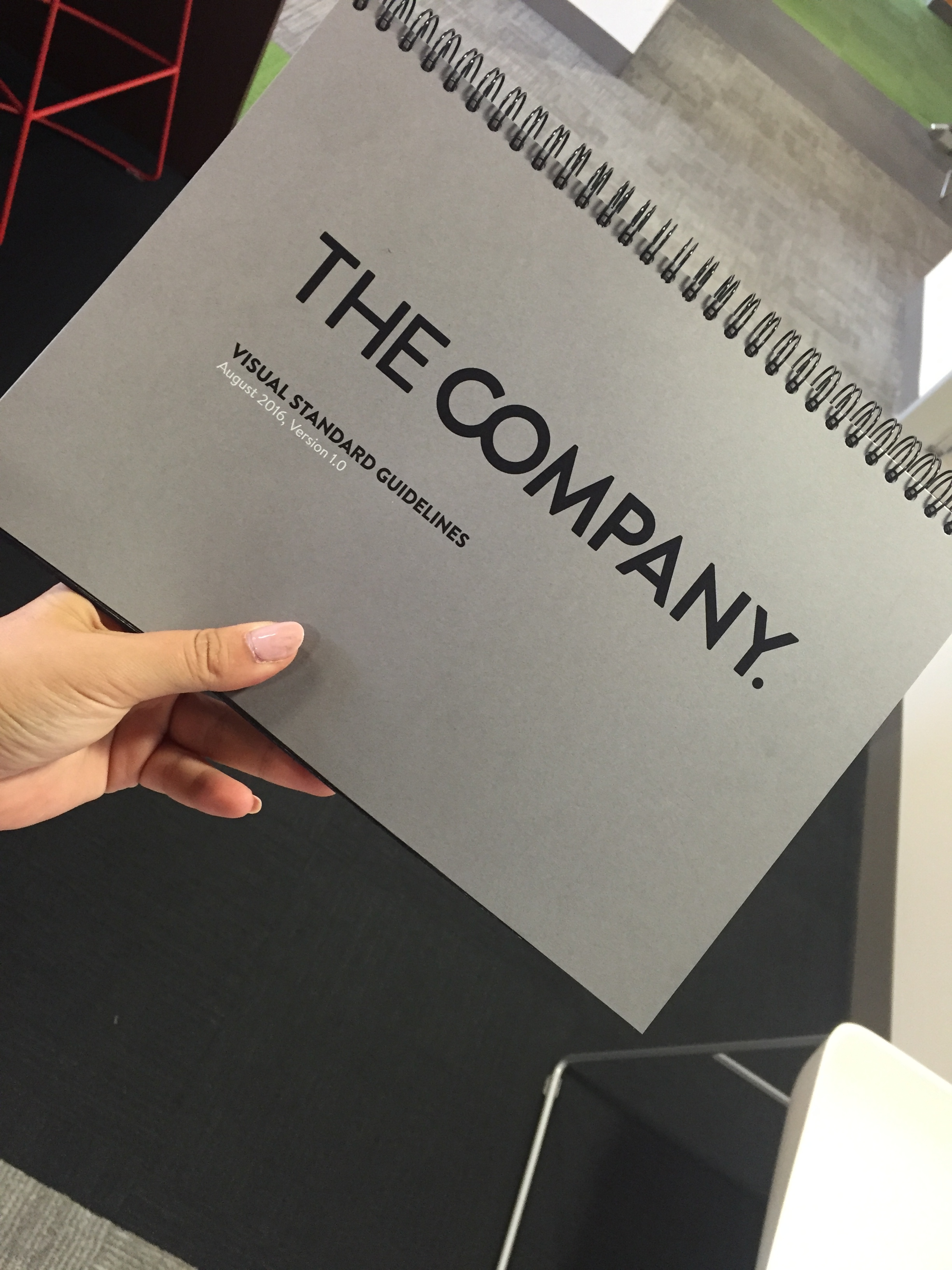
Brand Guide

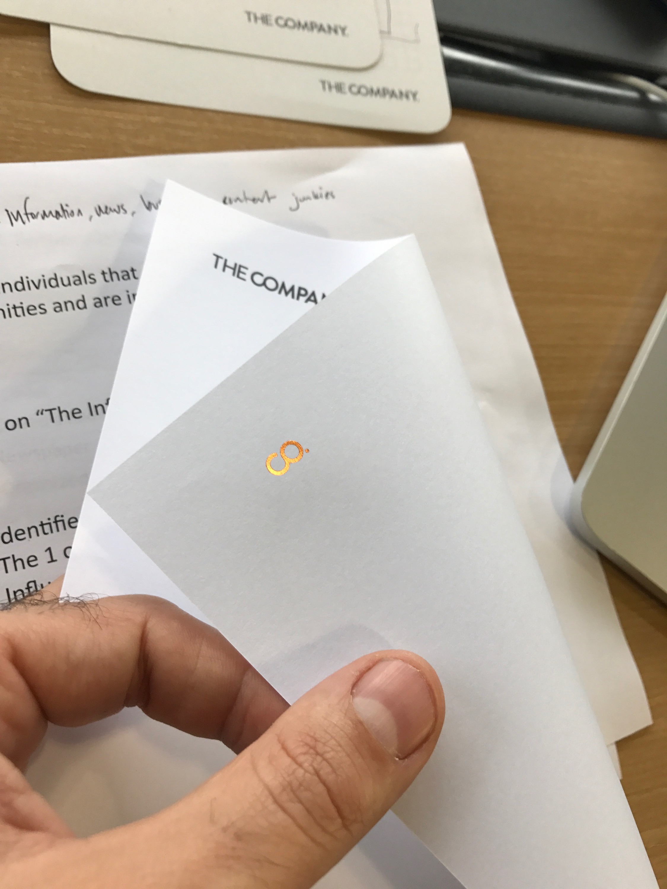
Test Prints & Process
Credits
Client THE COMPANY
Brand Designer CELIA JABER
Photography & Art Direction CELIA JABER
Executive Creative Director JOSH OKUN